library(tidyverse)
library(scales)

cornell_deg <- read_csv("data/cornell-degrees.csv")AE 05: Pivoting Cornell Degrees
Suggested answers
Application exercise
Answers
Goal
Our ultimate goal in this application exercise is to make the following data visualization.
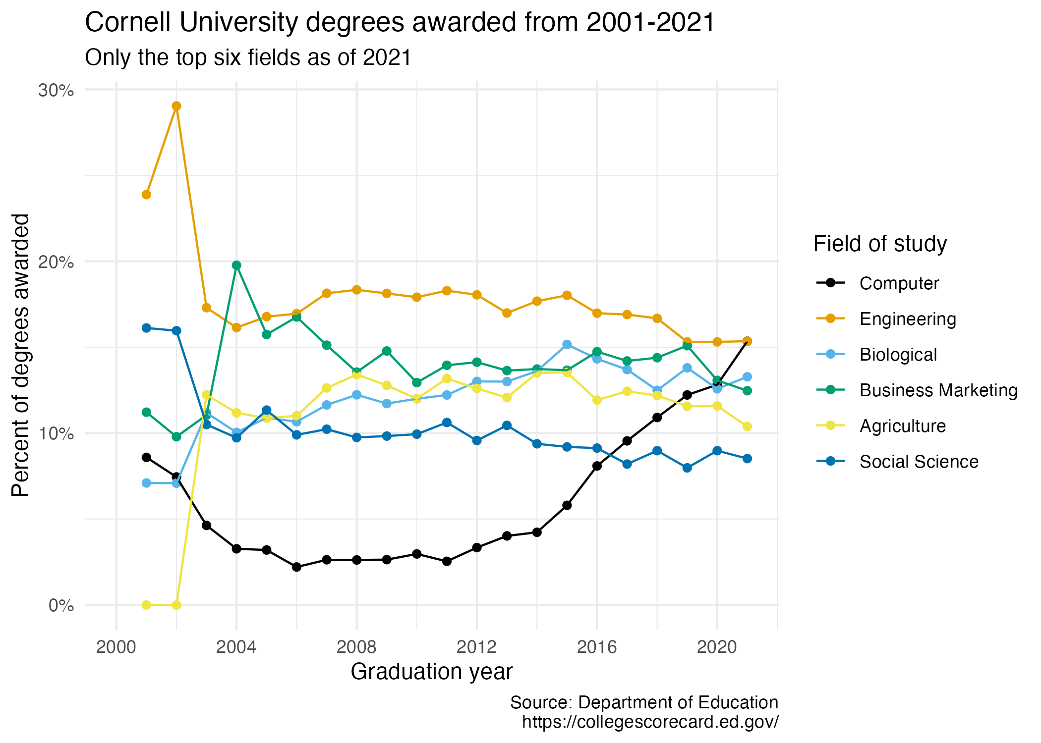
- Your turn (3 minutes): Take a close look at the plot and describe what it shows in 2-3 sentences.
Add your response here.
Data
The data come from the Department of Education’s College Scorecard.
They make the data available through online dashboards and an API, but I’ve prepared the data for you in a CSV file. Let’s load that in.
And let’s take a look at the data.
cornell_deg# A tibble: 6 × 22
field_of_study `2001` `2002` `2003` `2004` `2005` `2006` `2007` `2008` `2009`
<chr> <dbl> <dbl> <dbl> <dbl> <dbl> <dbl> <dbl> <dbl> <dbl>
1 Computer 0.0859 0.0745 0.0463 0.0327 0.032 0.0221 0.0263 0.0262 0.0264
2 Engineering 0.239 0.290 0.173 0.161 0.168 0.170 0.181 0.183 0.181
3 Biological 0.071 0.0709 0.112 0.100 0.109 0.107 0.116 0.122 0.117
4 Business Marke… 0.112 0.0979 0.110 0.198 0.157 0.168 0.151 0.136 0.148
5 Agriculture 0 0 0.122 0.112 0.109 0.110 0.126 0.134 0.128
6 Social Science 0.161 0.160 0.105 0.0973 0.113 0.099 0.102 0.0975 0.0983
# ℹ 12 more variables: `2010` <dbl>, `2011` <dbl>, `2012` <dbl>, `2013` <dbl>,
# `2014` <dbl>, `2015` <dbl>, `2016` <dbl>, `2017` <dbl>, `2018` <dbl>,
# `2019` <dbl>, `2020` <dbl>, `2021` <dbl>The dataset has 6 rows and 22 columns. The first column (variable) is the field_of_study, which are the 6 most frequent fields of study for students graduating in 2021.1 The remaining columns show the proportion of degrees awarded in each year from 2001-2021.
- Your turn (4 minutes): Take a look at the plot we aim to make and sketch the data frame we need to make the plot. Determine what each row and each column of the data frame should be. Hint: We need data to be in columns to map to
aesthetic elements of the plot.Columns:
year,pct,field_of_studyRows: Combination of year and field of study
Note
Confused why we don’t want one row for each year and one column for each field of study? See the appendix.
Pivoting
- Demo: Pivot the
cornell_degdata frame longer such that each row represents a field of study / year combination andyearandnumber of graduates for that year are columns in the data frame.
cornell_deg |>
  pivot_longer(
    cols = -field_of_study,
    names_to = "year",
    values_to = "pct"
  )
# A tibble: 126 × 3
field_of_study year pct
<chr> <chr> <dbl>
1 Computer 2001 0.0859
2 Computer 2002 0.0745
3 Computer 2003 0.0463
4 Computer 2004 0.0327
5 Computer 2005 0.032
6 Computer 2006 0.0221
7 Computer 2007 0.0263
8 Computer 2008 0.0262
9 Computer 2009 0.0264
10 Computer 2010 0.0297
# ℹ 116 more rows- Question: What is the type of the
yearvariable? Why? What should it be?
It’s a character (chr) variable since the information came from the columns of the original data frame and R cannot know that these character strings represent years. The variable type should be numeric.
- Demo: Start over with pivoting, and this time also make sure
yearis a numerical variable in the resulting data frame.
cornell_deg |>
  pivot_longer(
    cols = -field_of_study,
    names_to = "year",
    names_transform = parse_number,
    values_to = "pct"
  )
# A tibble: 126 × 3
field_of_study year pct
<chr> <dbl> <dbl>
1 Computer 2001 0.0859
2 Computer 2002 0.0745
3 Computer 2003 0.0463
4 Computer 2004 0.0327
5 Computer 2005 0.032
6 Computer 2006 0.0221
7 Computer 2007 0.0263
8 Computer 2008 0.0262
9 Computer 2009 0.0264
10 Computer 2010 0.0297
# ℹ 116 more rowsPlotting
- Your turn (5 minutes): Now we start making our plot, but let’s not get too fancy right away. Create the following plot, which will serve as the “first draft” on the way to our Goal. Do this by adding on to your pipeline from earlier.
cornell_deg |>
  pivot_longer(
    cols = -field_of_study,
    names_to = "year",
    names_transform = parse_number,
    values_to = "pct"
  ) |>
  ggplot(aes(x = year, y = pct, color = field_of_study)) +
  geom_point() +
  geom_line()
- Your turn (4 minutes): What aspects of the plot need to be updated to go from the draft you created above to the Goal plot at the beginning of this application exercise.
x-axis scale: need to go from 2000 to 2020 in increments of 4 years
y-axis scale: percentage labeling
line colors
axis labels: title, subtitle, x, y, caption
theme
legend: position, order of values, and border
- Demo: Update x-axis scale such that the years displayed go from 2000 to 2020 in increments of 4 years. Update y-axis scale so it uses percentage formatting. Do this by adding on to your pipeline from earlier.
cornell_deg |>
  pivot_longer(
    cols = -field_of_study,
    names_to = "year",
    names_transform = parse_number,
    values_to = "pct"
  ) |>
  ggplot(aes(x = year, y = pct, color = field_of_study)) +
  geom_point() +
  geom_line() +
  scale_x_continuous(limits = c(2000, 2021), breaks = seq(2000, 2020, 4)) +
  scale_y_continuous(labels = label_percent())
- Demo: Update the order of the values in the legend so they match the order of the lines in the plot. Do this by adding on to your pipeline from earlier.
cornell_deg |>
  pivot_longer(
    cols = -field_of_study,
    names_to = "year",
    names_transform = parse_number,
    values_to = "pct"
  ) |>
  mutate(
    field_of_study = fct_relevel(
      field_of_study, "Computer", "Engineering", "Biological",
      "Business Marketing", "Agriculture", "Social Science"
    )
  ) |>
  ggplot(aes(x = year, y = pct, color = field_of_study)) +
  geom_point() +
  geom_line() +
  scale_x_continuous(limits = c(2000, 2021), breaks = seq(2000, 2020, 4)) +
  scale_y_continuous(labels = label_percent())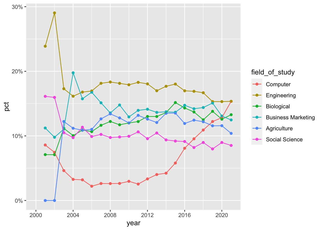
Tip
Instead of coding the field_of_study values manually, you can use fct_reorder2() from the forcats package to reorder the levels of a factor based on the values of another variable.
field_of_study = fct_reorder2(
  .f = field_of_study,
  .x = year,
  .y = pct
)
where it reorders the factor by the .y values associated with the largest .x values. This ensures the line colors in the legend match up to the end of the lines in the plot.
- Demo: Update line colors using the
scale_color_colorblind()palette from ggthemes. Once again, do this by adding on to your pipeline from earlier.
library(ggthemes)

cornell_deg |>
  pivot_longer(
    cols = -field_of_study,
    names_to = "year",
    names_transform = parse_number,
    values_to = "pct"
  ) |>
  mutate(
    field_of_study = fct_relevel(
      field_of_study, "Computer", "Engineering", "Biological",
      "Business Marketing", "Agriculture", "Social Science"
    )
  ) |>
  ggplot(aes(x = year, y = pct, color = field_of_study)) +
  geom_point() +
  geom_line() +
  scale_x_continuous(limits = c(2000, 2021), breaks = seq(2000, 2020, 4)) +
  scale_y_continuous(labels = label_percent()) +
  scale_color_colorblind()
- Your turn (4 minutes): Update the plot labels (
title,subtitle,x,y, andcaption) and usetheme_minimal(). Once again, do this by adding on to your pipeline from earlier.
cornell_deg |>
  pivot_longer(
    cols = -field_of_study,
    names_to = "year",
    names_transform = parse_number,
    values_to = "pct"
  ) |>
  mutate(
    field_of_study = fct_relevel(
      field_of_study, "Computer", "Engineering", "Biological",
      "Business Marketing", "Agriculture", "Social Science"
    )
  ) |>
  ggplot(aes(x = year, y = pct, color = field_of_study)) +
  geom_point() +
  geom_line() +
  scale_x_continuous(limits = c(2000, 2021), breaks = seq(2000, 2020, 4)) +
  scale_color_colorblind() +
  scale_y_continuous(labels = label_percent()) +
  labs(
    x = "Graduation year",
    y = "Percent of degrees awarded",
    color = "Field of study",
    title = "Cornell University degrees awarded from 2001-2021",
    subtitle = "Only the top six fields as of 2021",
    caption = "Source: Department of Education\nhttps://collegescorecard.ed.gov/"
  ) +
  theme_minimal()
- Demo: Finally, set
fig-width: 7andfig-height: 5for your plot in the chunk options.
cornell_deg |>
  pivot_longer(
    cols = -field_of_study,
    names_to = "year",
    names_transform = parse_number,
    values_to = "pct"
  ) |>
  mutate(
    field_of_study = fct_relevel(
      field_of_study, "Computer", "Engineering", "Biological",
      "Business Marketing", "Agriculture", "Social Science"
    )
  ) |>
  ggplot(aes(x = year, y = pct, color = field_of_study)) +
  geom_point() +
  geom_line() +
  scale_x_continuous(limits = c(2000, 2021), breaks = seq(2000, 2020, 4)) +
  scale_color_colorblind() +
  scale_y_continuous(labels = label_percent()) +
  labs(
    x = "Graduation year",
    y = "Percent of degrees awarded",
    color = "Field of study",
    title = "Cornell University degrees awarded from 2001-2021",
    subtitle = "Only the top six fields as of 2021",
    caption = "Source: Department of Education\nhttps://collegescorecard.ed.gov/"
  ) +
  theme_minimal()
Appendix: Alternative tidying strategy
Another tidying strategy suggested in class was to structure it one row for each year and one column for each of the fields of study. We could do this by transposing the data frame, which requires a pivot_longer() |> pivot_wider() approach:
cornell_deg |>
  pivot_longer(
    cols = -field_of_study,
    names_to = "year",
    names_transform = parse_number,
    values_to = "pct"
  ) |>
  pivot_wider(
    names_from = field_of_study,
    values_from = pct
  )
# A tibble: 21 × 7
year Computer Engineering Biological `Business Marketing` Agriculture
<dbl> <dbl> <dbl> <dbl> <dbl> <dbl>
1 2001 0.0859 0.239 0.071 0.112 0
2 2002 0.0745 0.290 0.0709 0.0979 0
3 2003 0.0463 0.173 0.112 0.110 0.122
4 2004 0.0327 0.161 0.100 0.198 0.112
5 2005 0.032 0.168 0.109 0.157 0.109
6 2006 0.0221 0.170 0.107 0.168 0.110
7 2007 0.0263 0.181 0.116 0.151 0.126
8 2008 0.0262 0.183 0.122 0.136 0.134
9 2009 0.0264 0.181 0.117 0.148 0.128
10 2010 0.0297 0.179 0.12 0.129 0.12
# ℹ 11 more rows
# ℹ 1 more variable: `Social Science` <dbl>But now we need to construct the line graph with the percentages spread across six columns. It would require us writing a separate geom_*() function for each field of study:
cornell_deg |>
  pivot_longer(
    cols = -field_of_study,
    names_to = "year",
    names_transform = parse_number,
    values_to = "pct"
  ) |>
  pivot_wider(
    names_from = field_of_study,
    values_from = pct
  ) |>
  ggplot(aes(x = year)) +
  geom_point(mapping = aes(y = Computer)) +
  geom_line(mapping = aes(y = Computer)) +
  geom_point(mapping = aes(y = Engineering)) +
  geom_line(mapping = aes(y = Engineering)) +
  geom_point(mapping = aes(y = Biological)) +
  geom_line(mapping = aes(y = Biological)) +
  geom_point(mapping = aes(y = `Business Marketing`)) +
  geom_line(mapping = aes(y = `Business Marketing`)) +
  geom_point(mapping = aes(y = Agriculture)) +
  geom_line(mapping = aes(y = Agriculture)) +
  geom_point(mapping = aes(y = `Social Science`)) +
geom_line(mapping = aes(y = `Social Science`))![]()
And we still don’t have color-coding. We could use the colorargument in each geom_*() function to change the color of each layer.
cornell_deg |>
  pivot_longer(
    cols = -field_of_study,
    names_to = "year",
    names_transform = parse_number,
    values_to = "pct"
  ) |>
  pivot_wider(
    names_from = field_of_study,
    values_from = pct
  ) |>
  ggplot(aes(x = year)) +
  geom_point(mapping = aes(y = Computer), color = "black") +
  geom_line(mapping = aes(y = Computer), color = "black") +
  geom_point(mapping = aes(y = Engineering), color = "orange") +
  geom_line(mapping = aes(y = Engineering), color = "orange") +
  geom_point(mapping = aes(y = Biological), color = "lightblue") +
  geom_line(mapping = aes(y = Biological), color = "lightblue") +
  geom_point(mapping = aes(y = `Business Marketing`), color = "green") +
  geom_line(mapping = aes(y = `Business Marketing`), color = "green") +
  geom_point(mapping = aes(y = Agriculture), color = "yellow") +
  geom_line(mapping = aes(y = Agriculture), color = "yellow") +
  geom_point(mapping = aes(y = `Social Science`), color = "darkblue") +
geom_line(mapping = aes(y = `Social Science`), color = "darkblue")![]()
But we still do not have a legend that tells us what each color represents. We want a legend generated automatically and that only happens if we map something to the color channel using aes(). We can hack this a bit by passing a character string within aes() to define a different unique value for each layer.
cornell_deg |>
  pivot_longer(
    cols = -field_of_study,
    names_to = "year",
    names_transform = parse_number,
    values_to = "pct"
  ) |>
  pivot_wider(
    names_from = field_of_study,
    values_from = pct
  ) |>
  ggplot(aes(x = year)) +
  geom_point(mapping = aes(y = Computer, color = "Computer")) +
  geom_line(mapping = aes(y = Computer, color = "Computer")) +
  geom_point(mapping = aes(y = Engineering, color = "Engineering")) +
  geom_line(mapping = aes(y = Engineering, color = "Engineering")) +
  geom_point(mapping = aes(y = Biological, color = "Biological")) +
  geom_line(mapping = aes(y = Biological, color = "Biological")) +
  geom_point(mapping = aes(y = `Business Marketing`, color = "Business Marketing")) +
  geom_line(mapping = aes(y = `Business Marketing`, color = "Business Marketing")) +
  geom_point(mapping = aes(y = Agriculture, color = "Agriculture")) +
  geom_line(mapping = aes(y = Agriculture, color = "Agriculture")) +
  geom_point(mapping = aes(y = `Social Science`, color = "Social Science")) +
geom_line(mapping = aes(y = `Social Science`, color = "Social Science"))![]()
Polished up we get the same plot.
cornell_deg |>
  pivot_longer(
    cols = -field_of_study,
    names_to = "year",
    names_transform = parse_number,
    values_to = "pct"
  ) |>
  pivot_wider(
    names_from = field_of_study,
    values_from = pct
  ) |>
  ggplot(aes(x = year)) +
  geom_point(mapping = aes(y = Computer, color = "Computer")) +
  geom_line(mapping = aes(y = Computer, color = "Computer")) +
  geom_point(mapping = aes(y = Engineering, color = "Engineering")) +
  geom_line(mapping = aes(y = Engineering, color = "Engineering")) +
  geom_point(mapping = aes(y = Biological, color = "Biological")) +
  geom_line(mapping = aes(y = Biological, color = "Biological")) +
  geom_point(mapping = aes(y = `Business Marketing`, color = "Business Marketing")) +
  geom_line(mapping = aes(y = `Business Marketing`, color = "Business Marketing")) +
  geom_point(mapping = aes(y = Agriculture, color = "Agriculture")) +
  geom_line(mapping = aes(y = Agriculture, color = "Agriculture")) +
  geom_point(mapping = aes(y = `Social Science`, color = "Social Science")) +
  geom_line(mapping = aes(y = `Social Science`, color = "Social Science")) +
  scale_x_continuous(limits = c(2000, 2021), breaks = seq(2000, 2020, 4)) +
  scale_color_colorblind(breaks = c("Computer", "Engineering", "Biological",
      "Business Marketing", "Agriculture", "Social Science")) +
  scale_y_continuous(labels = label_percent()) +
  labs(
    x = "Graduation year",
    y = "Percent of degrees awarded",
    color = "Field of study",
    title = "Cornell University degrees awarded from 2001-2021",
    subtitle = "Only the top six fields as of 2021",
    caption = "Source: Department of Education\nhttps://collegescorecard.ed.gov/"
  ) +
theme_minimal()![]()
But with a lot more effort.
Session information
sessioninfo::session_info()─ Session info ───────────────────────────────────────────────────────────────
setting value
version R version 4.3.2 (2023-10-31)
os macOS Ventura 13.5.2
system aarch64, darwin20
ui X11
language (EN)
collate en_US.UTF-8
ctype en_US.UTF-8
tz America/New_York
date 2024-02-15
pandoc 3.1.1 @ /Applications/RStudio.app/Contents/Resources/app/quarto/bin/tools/ (via rmarkdown)
─ Packages ───────────────────────────────────────────────────────────────────
package * version date (UTC) lib source
bit 4.0.5 2022-11-15 [1] CRAN (R 4.3.0)
bit64 4.0.5 2020-08-30 [1] CRAN (R 4.3.0)
cli 3.6.2 2023-12-11 [1] CRAN (R 4.3.1)
colorspace 2.1-0 2023-01-23 [1] CRAN (R 4.3.0)
crayon 1.5.2 2022-09-29 [1] CRAN (R 4.3.0)
digest 0.6.34 2024-01-11 [1] CRAN (R 4.3.1)
dplyr * 1.1.4 2023-11-17 [1] CRAN (R 4.3.1)
evaluate 0.23 2023-11-01 [1] CRAN (R 4.3.1)
fansi 1.0.6 2023-12-08 [1] CRAN (R 4.3.1)
farver 2.1.1 2022-07-06 [1] CRAN (R 4.3.0)
fastmap 1.1.1 2023-02-24 [1] CRAN (R 4.3.0)
forcats * 1.0.0 2023-01-29 [1] CRAN (R 4.3.0)
generics 0.1.3 2022-07-05 [1] CRAN (R 4.3.0)
ggplot2 * 3.4.4 2023-10-12 [1] CRAN (R 4.3.1)
ggthemes * 5.0.0 2023-11-21 [1] CRAN (R 4.3.1)
glue 1.7.0 2024-01-09 [1] CRAN (R 4.3.1)
gtable 0.3.4 2023-08-21 [1] CRAN (R 4.3.0)
here 1.0.1 2020-12-13 [1] CRAN (R 4.3.0)
hms 1.1.3 2023-03-21 [1] CRAN (R 4.3.0)
htmltools 0.5.7 2023-11-03 [1] CRAN (R 4.3.1)
htmlwidgets 1.6.4 2023-12-06 [1] CRAN (R 4.3.1)
jsonlite 1.8.8 2023-12-04 [1] CRAN (R 4.3.1)
knitr 1.45 2023-10-30 [1] CRAN (R 4.3.1)
labeling 0.4.3 2023-08-29 [1] CRAN (R 4.3.0)
lifecycle 1.0.4 2023-11-07 [1] CRAN (R 4.3.1)
lubridate * 1.9.3 2023-09-27 [1] CRAN (R 4.3.1)
magrittr 2.0.3 2022-03-30 [1] CRAN (R 4.3.0)
munsell 0.5.0 2018-06-12 [1] CRAN (R 4.3.0)
pillar 1.9.0 2023-03-22 [1] CRAN (R 4.3.0)
pkgconfig 2.0.3 2019-09-22 [1] CRAN (R 4.3.0)
purrr * 1.0.2 2023-08-10 [1] CRAN (R 4.3.0)
R6 2.5.1 2021-08-19 [1] CRAN (R 4.3.0)
ragg 1.2.7 2023-12-11 [1] CRAN (R 4.3.1)
readr * 2.1.5 2024-01-10 [1] CRAN (R 4.3.1)
rlang 1.1.3 2024-01-10 [1] CRAN (R 4.3.1)
rmarkdown 2.25 2023-09-18 [1] CRAN (R 4.3.1)
rprojroot 2.0.4 2023-11-05 [1] CRAN (R 4.3.1)
rstudioapi 0.15.0 2023-07-07 [1] CRAN (R 4.3.0)
scales * 1.2.1 2024-01-18 [1] Github (r-lib/scales@c8eb772)
sessioninfo 1.2.2 2021-12-06 [1] CRAN (R 4.3.0)
stringi 1.8.3 2023-12-11 [1] CRAN (R 4.3.1)
stringr * 1.5.1 2023-11-14 [1] CRAN (R 4.3.1)
systemfonts 1.0.5 2023-10-09 [1] CRAN (R 4.3.1)
textshaping 0.3.7 2023-10-09 [1] CRAN (R 4.3.1)
tibble * 3.2.1 2023-03-20 [1] CRAN (R 4.3.0)
tidyr * 1.3.0 2023-01-24 [1] CRAN (R 4.3.0)
tidyselect 1.2.0 2022-10-10 [1] CRAN (R 4.3.0)
tidyverse * 2.0.0 2023-02-22 [1] CRAN (R 4.3.0)
timechange 0.2.0 2023-01-11 [1] CRAN (R 4.3.0)
tzdb 0.4.0 2023-05-12 [1] CRAN (R 4.3.0)
utf8 1.2.4 2023-10-22 [1] CRAN (R 4.3.1)
vctrs 0.6.5 2023-12-01 [1] CRAN (R 4.3.1)
vroom 1.6.5 2023-12-05 [1] CRAN (R 4.3.1)
withr 2.5.2 2023-10-30 [1] CRAN (R 4.3.1)
xfun 0.41 2023-11-01 [1] CRAN (R 4.3.1)
yaml 2.3.8 2023-12-11 [1] CRAN (R 4.3.1)
[1] /Library/Frameworks/R.framework/Versions/4.3-arm64/Resources/library
──────────────────────────────────────────────────────────────────────────────Footnotes
For the sake of application, I omitted the other 32 possible fields of study.↩︎