library(tidyverse)
library(scales)Lab 02 - Data tidying
Lab
Important
This lab is due February 19 at 11:59pm.
Learning goals
In this lab, you will…
- use pivoting to reshape data
- use joins to bring together two datasets
- continue developing a workflow for reproducible data analysis
- utilize automated helpers to assist with code style and best practices
- continue working with data visualization tools
Getting started
Go to the info2950-sp24 organization on GitHub. Click on the repo with the prefix lab-02. It contains the starter documents you need to complete the lab.
Clone the repo and start a new project in RStudio. See the Lab 0 instructions for details on cloning a repo and starting a new R project.
First, open the Quarto document
lab-02.qmdand Render it.Make sure it compiles without errors.
Team submission
All team members should clone the team GitHub repository for the lab. Then, one team member should edit the document YAML by adding the team name to the subtitle field and adding the names of the team members contributing to lab to the author field. Hopefully that’s everyone, but if someone doesn’t contribute during the lab session or throughout the week before the deadline, their name should not be added. If you have 4 members in your team, you can delete the line for the 5th team member. Then, this team member should render the document and commit and push the changes. All others should not touch the document at this stage.
title: "Lab 02 - Data tidying"
subtitle: "Team name"
author:
  - "Team member 1 (netID)"
  - "Team member 2 (netID)"
  - "Team member 3 (netID)"
  - "Team member 4 (netID)"
  - "Team member 5 (netID)"
date: today
format: pdf
editor: source
styler for code formatting
Using appropriate code style and adhering to a comprehensive style guide can be complicated at times. styler is an R package that formats your code according to the tidyverse style guide so you can focus your attention on the content of your code. RStudio includes an interactive “Addin” that makes it (mostly) straight-forward to format your code in a Quarto document.
Use styler on poorly-formatted code
Important
Pick a member of the team to complete the styler section. All others should contribute to the discussion but only one person should type up the answer, render the document, commit, and push to GitHub. All others should not touch the document.
- Open
ae-00-unvotes.qmdin your repository. Render the document. Does it work successfully? How easy or hard is it to read the code and understand what it does? - Switch RStudio to Source Editor mode using the options in the top-left corner of the code editor panel.
Important
The styler RStudio addin will not work when your IDE is in Visual Editor mode. This is a bug in RStudio that is yet to be fixed.
Open the command palette (either ctrl + shift + p or cmd + shift + p) and select “Style active file”.
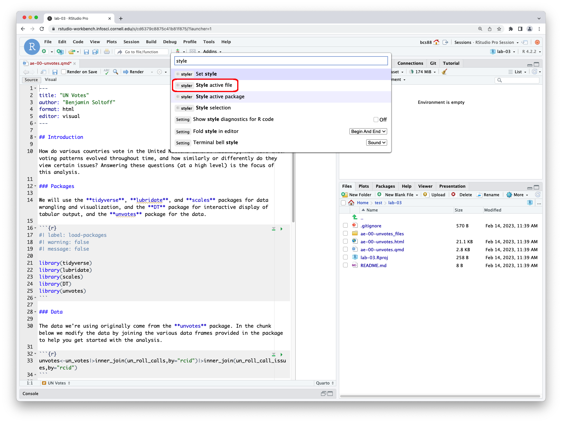
Observe how the code chunks have now been modifed.
The file remains unsaved. Save and render the document. Examine the output. How easy is it to read the code? Did it fix all the problems?
Switch the IDE back to Visual Editor mode (if you prefer it). Fix the remaining issues with the code. Render one more time and check that the code is fully readable in the HTML document.
After the team member working on styler renders, commits, and pushes, another team member should pull their changes and render the document. Then, they should write the answer to Exercise 1-2. All others should contribute to the discussion but only one person should type up the answer, render the document, commit, and push to GitHub. All others should not touch the document.
Warning
You do not need to submit any of the contents of your ae-00-unvotes.html file as part of lab-02 on Gradescope. This is ungraded practice so that you can use styler to assist you with writing clean, interpretable code for your other course assignments (and life).
Warm up
Before we introduce the data, let’s warm up with some simple exercises.
- Update the YAML, changing the author name to your name, and render the document.
- Commit your changes with a meaningful commit message.
- Push your changes to GitHub.
- Go to your repo on GitHub and confirm that your changes are visible in your
.qmdand .pdffiles. If anything is missing, render, commit, and push again.
Packages
We’ll use the tidyverse package for much of the data wrangling and the scales package for better plot labels. These packages are already installed for you. You can load it by running the following in your Console:
Data
The datasets that you will work with in this dataset come from the Organization for Economic Co-Operation and Development (OECD), stats.oecd.org.
Part 1: Inflation across the world
For this part of the analysis you will work with inflation data from various countries in the world over the last 30 years.
country_inflation <- read_csv("data/country-inflation.csv")What does each row of the
country_inflationdataset represent? What are the columns in the dataset and what do they represent?Reshape (pivot)
country_inflationsuch that each row represents a country/year combination, with columnscountry,year, andannual_inflation. Make sure thatannual_inflationis a numeric variable. Save the result as a new data frame – you should give it a concise and informative name.
After the team member working on Exercise 2 renders, commits, and pushes, another team member should pull their changes and render the document. Then, they should write the answer to Exercise 3-4. All others should contribute to the discussion but only one person should type up the answer, render the document, commit, and push to GitHub. All others should not touch the document.
Create a vector called
countries_of_interestwhich contains the names of countries you want to visualize the inflation rates for over the years. For example, if these countries are Türkiye and United States, you can express this as follows:countries_of_interest <- c("Türkiye", "United States")Your
countries_of_interestshould consist of no more than five countries. Make sure that the spelling of your countries matches how they appear in the dataset.In a single pipeline, filter your reshaped dataset to include only the
countries_of_interestfrom the previous exercise and create a plot of annual inflation vs. year for these countries. Then, in a few sentences, state why you chose these countries and describe the patterns you observe in the plot, particularly focusing on anything you find surprising or not surprising, based on your knowledge (or lack thereof) of these countries economies.Data should be represented with points as well as lines connecting the points for each country.
Each country should be represented by a different color line.
Axes and legend should be properly labeled.
The plot should have an appropriate title (and optionally a subtitle).
Axis labels for annual inflation should be shown in percentages (e.g., 25% not 25). Hint: The
label_percent()function from the scales package will be useful.ggplot(...) + ... + scale_y_continuous(label = label_percent(scale = 1))
After the team member working on Exercise 4 renders, commits, and pushes, another team member should pull their changes and render the document. Then, they should write the answer to Exercise 5-6. All others should contribute to the discussion but only one person should type up the answer, render the document, commit, and push to GitHub. All others should not touch the document.
Part 2: Inflation in the US
The OECD defines inflation as follows:
Inflation is a rise in the general level of prices of goods and services that households acquire for the purpose of consumption in an economy over a period of time.
The main measure of inflation is the annual inflation rate which is the movement of the Consumer Price Index (CPI) from one month/period to the same month/period of the previous year expressed as percentage over time.
Source: OECD CPI FAQ
CPI is broken down into 12 divisions such as food, housing, health, etc. Your goal in this part is to create another time series plot of annual inflation, this time for US only.
The data you will need to create this visualization is spread across two files:
us-inflation.csv: Annual inflation rate for the US for 12 CPI divisions. Each division is identified by an ID number.cpi-divisions.csv: A “lookup table” of CPI division ID numbers and their descriptions.
Let’s load both of these files.
us_inflation <- read_csv("data/us-inflation.csv")
cpi_divisions <- read_csv("data/cpi-divisions.csv")- Add a column to the
us_inflationdataset calleddescriptionwhich has the CPI division description that matches thecpi_division_id, by joining the two datasets.Determine which type of join is the most appropriate one and use that.
Note that the two datasets don’t have a common variable. Review the help for the join functions to determine how to use the
byargument when the names of the variables that the datasets should be joined by are different.
- Create a vector called
divisions_of_interestwhich contains the descriptions or IDs of CPI divisions you want to visualize. Yourdivisions_of_interestshould consist of no more than five divisions. If you’re using descriptions, make sure that the spelling of your divisions matches how they appear in the dataset.
After the team member working on Exercise 6 renders, commits, and pushes, another team member should pull their changes and render the document. Then, they should write the answer to Exercise 7. All others should contribute to the discussion but only one person should type up the answer, render the document, commit, and push to GitHub. All others should not touch the document.
- In a single pipeline, filter your joined dataset to include only the
divisions_of_interestfrom the previous exercise and create a plot of annual inflation vs. year for these divisions. Then, in a few sentences, state why you chose these divisions and describe the patterns you observe in the plot, particularly focusing on anything you find surprising or not surprising, based on your knowledge (or lack thereof) of inflation rates in the US over the last decade.Data should be represented with points as well as lines connecting the points for each division.
Each division should be represented by a different color.
Axes and legend should be properly labeled.
If your legend has labels that are too long, you can try moving the legend to the bottom and stack the labels vertically. Hint: The
legend.positionandlegend.directionarguments of thetheme()functions will be useful.ggplot(...) + ... + theme( legend.position = "bottom", legend.direction = "vertical" )The plot should have an appropriate title (and optionally a subtitle).
Axis labels for annual inflation should be shown in percentages (e.g., 25% not 25).
After the team member working on Exercise 7 renders, commits, and pushes, all other team members should pull the changes and render the document. Finally, a team member different than the one responsible for typing up responses to Exercise 7 should do the last task outlined below.
Closing an issue with a commit
Go to your GitHub repository, you will see an issue with the title “Learn to close an issue with a commit”. Your goal is to close this issue with a commit to practice this workflow, which is the workflow you will use when you are addressing feedback on your projects.
- Go to the relevant section in your lab .qmd file.
- Delete the sentence that says “Delete me”.
- Render the document.
- Commit your changes from the git tab with the commit message “Delete sentence, closes #1.”
- Push your changes to your repo and observe that the issue is now closed and the commit associated with this move is linked from the issue.
GitHub allows you to close an issue directly with commits if the commit uses one of the following keywords followed bu the issue number (which you can find next to the issue title): close, closes, closed, fix, fixes, fixed, resolve, resolves, and resolved.
Submission
Once you are finished with the lab, you will submit your final PDF document to Gradescope.
Warning
Before you wrap up the assignment, make sure all documents are updated on your GitHub repo. We will be checking these to make sure you have been practicing how to commit and push changes.
You must turn in a PDF file to the Gradescope page by the submission deadline to be considered “on time”.
To submit your assignment:
- Go to http://www.gradescope.com and click Log in in the top right corner.
- Click School Credentials \(\rightarrow\) Cornell University NetID and log in using your NetID credentials.
- Click on your INFO 2950 course.
- Click on the assignment, and you’ll be prompted to submit it.
- Mark all the pages associated with exercise. All the pages of your lab should be associated with at least one question (i.e., should be “checked”).
- Select all pages of your .pdf submission to be associated with the “Workflow & formatting” question.
Team submission (Gradescope)
Grading
| Component | Points |
|---|---|
| Ex 1 | 3 |
| Ex 2 | 6 |
| Ex 3 | 4 |
| Ex 4 | 12 |
| Ex 5 | 4 |
| Ex 6 | 4 |
| Ex 7 | 12 |
| Workflow & formatting | 5 |
| Total | 50 |
Note
The “Workflow & formatting” component assesses the reproducible workflow. This includes:
- Having at least 3 informative commit messages
- Each team member contributing to the repo with commits at least once
- Following tidyverse code style
- All code being visible in rendered PDF (no more than 80 characters)
- The issue being closed with a commit message
Acknowledgments
- This assignment is derived from STA 199: Introduction to Data Science