library(tidyverse)
library(scales)

cornell_deg <- read_csv("data/cornell-degrees.csv")AE 05: Pivoting Cornell Degrees
Application exercise
Important
Go to the course GitHub organization and locate the repo titled ae-05-YOUR_GITHUB_USERNAME to get started.
This AE is due February 14 ❤️ at 11:59pm.
Goal
Our ultimate goal in this application exercise is to make the following data visualization.
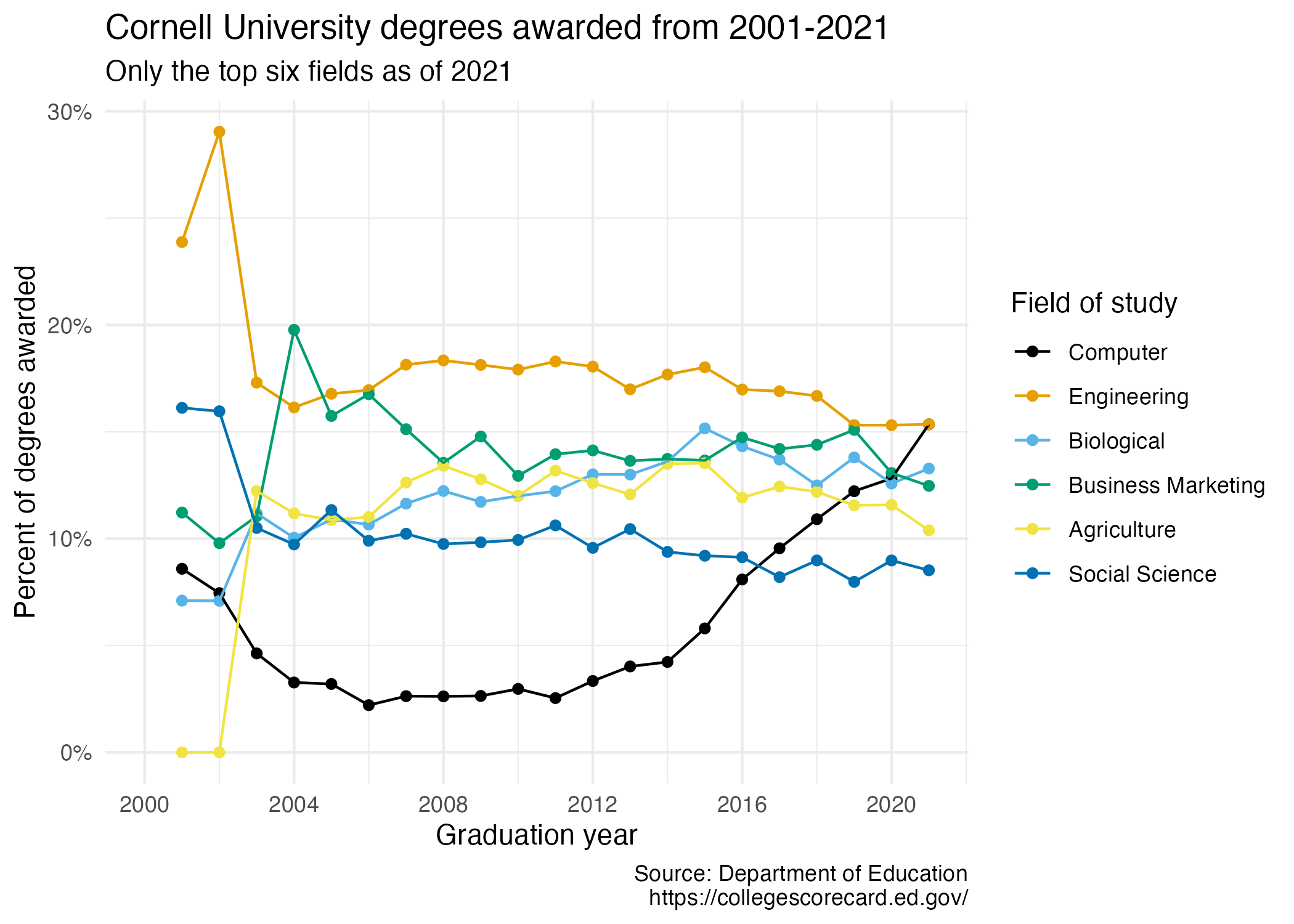
- Your turn (3 minutes): Take a close look at the plot and describe what it shows in 2-3 sentences.
Add your response here.
Data
The data come from the Department of Education’s College Scorecard.
They make the data available through online dashboards and an API, but I’ve prepared the data for you in a CSV file. Let’s load that in.
And let’s take a look at the data.
cornell_deg# A tibble: 6 × 22
field_of_study `2001` `2002` `2003` `2004` `2005` `2006` `2007` `2008` `2009`
<chr> <dbl> <dbl> <dbl> <dbl> <dbl> <dbl> <dbl> <dbl> <dbl>
1 Computer 0.0859 0.0745 0.0463 0.0327 0.032 0.0221 0.0263 0.0262 0.0264
2 Engineering 0.239 0.290 0.173 0.161 0.168 0.170 0.181 0.183 0.181
3 Biological 0.071 0.0709 0.112 0.100 0.109 0.107 0.116 0.122 0.117
4 Business Marke… 0.112 0.0979 0.110 0.198 0.157 0.168 0.151 0.136 0.148
5 Agriculture 0 0 0.122 0.112 0.109 0.110 0.126 0.134 0.128
6 Social Science 0.161 0.160 0.105 0.0973 0.113 0.099 0.102 0.0975 0.0983
# ℹ 12 more variables: `2010` <dbl>, `2011` <dbl>, `2012` <dbl>, `2013` <dbl>,
# `2014` <dbl>, `2015` <dbl>, `2016` <dbl>, `2017` <dbl>, `2018` <dbl>,
# `2019` <dbl>, `2020` <dbl>, `2021` <dbl>The dataset has 6 rows and 22 columns. The first column (variable) is the field_of_study, which are the 6 most frequent fields of study for students graduating in 2021.1 The remaining columns show the proportion of degrees awarded in each year from 2001-2021.
- Your turn (4 minutes): Take a look at the plot we aim to make and sketch the data frame we need to make the plot. Determine what each row and each column of the data frame should be. Hint: We need data to be in columns to map to
aesthetic elements of the plot.Columns: Add response here
Rows: Add response here
Pivoting
- Demo: Pivot the
cornell_degdata frame longer such that each row represents a field of study / year combination andyearandnumber of graduates for that year are columns in the data frame.
# add your code hereQuestion: What is the type of the
yearvariable? Why? What should it be?Add your response here.
Demo: Start over with pivoting, and this time also make sure
yearis a numerical variable in the resulting data frame.
# add your code herePlotting
- Your turn (5 minutes): Now we start making our plot, but let’s not get too fancy right away. Create the following plot, which will serve as the “first draft” on the way to our Goal. Do this by adding on to your pipeline from earlier.

# add your code hereYour turn (4 minutes): What aspects of the plot need to be updated to go from the draft you created above to the Goal plot at the beginning of this application exercise.
Add your response here.
Demo: Update x-axis scale such that the years displayed go from 2000 to 2020 in increments of 4 years. Update y-axis scale so it uses percentage formatting. Do this by adding on to your pipeline from earlier.
# add your code here- Demo: Update the order of the values in the legend so they match the order of the lines in the plot. Do this by adding on to your pipeline from earlier.
# add your code here- Demo: Update line colors using the
scale_color_colorblind()palette from ggthemes. Once again, do this by adding on to your pipeline from earlier.
# add your code here- Your turn (4 minutes): Update the plot labels (
title,subtitle,x,y, andcaption) and usetheme_minimal(). Once again, do this by adding on to your pipeline from earlier.
# add your code here- Demo: Finally, set
fig-width: 7andfig-height: 5for your plot in the chunk options.
# add your code hereFootnotes
For the sake of application, I omitted the other 32 possible fields of study.↩︎